Beg, Steal & Borrow
I’ve gotten in the awkward habit on Bankers Anonymous of stealing monthly thoughts from an investment advisor named David Hultstrom of Financial Architects LLC – about whom I know very little – except that he writes very clearly and sensibly about personal investing.
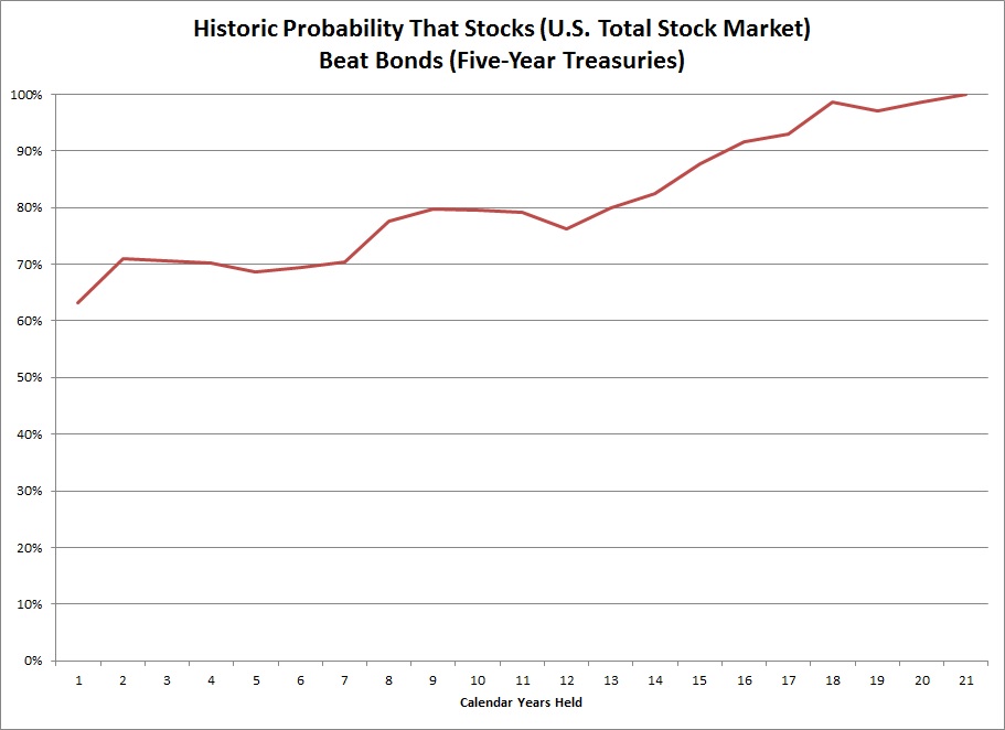
In this month’s note to his clients he addresses the issue of time horizon and the probability of stocks beating bonds, or more broadly stated, risky assets beating non-risky assets. Hultstrom provides a graphical illustration of the probability, based on historical data, of higher returns from stocks than from bonds. What his graph shows is that the longer your time horizon, the higher the probability that you will outperform if your portfolio holds stocks, or risky assets, rather than bonds, or non-risky assets.

Of course, history is no guarantee of future outcomes, but it can be a useful guide.
[NOTE: What I say next is my own personal interpretation of Hultstrom’s graph, not a paraphrase of his investing advice. I suspect from reading him over time that he would be more cautious than I am about to be. Also he has actual clients with money on the line and I do not have fiduciary responsibility for any individuals beyond my own family. So I can be pleasantly improvident and bold. Apologies in advance to Hultstrom for taking his great graph and using it for my own aggressive statements.]
Question: Where to invest?
Answer: 100% equities, for the long run
Whenever I hear someone wonder whether her retirement account should invest in a mix of stocks or bonds, or even whether his young child’s college fund should hold bonds, I wish for this graphical presentation. Maybe I will start carrying it around in my back pocket, and I’ll wave it in front of people seeking the false security of bonds. Long-horizon projects like retirement – or a young child’s college fund – must be almost entirely dedicated to equities or similarly risky assets.
You can’t afford to invest in bonds, or cash, or money markets.
Of course, not necessarily for the short run
If you have a 1 to 5 year investment horizon, you take a considerable risk owning stocks, relative to bonds. Considering Hultstrom’s graphic, you run a 30% risk of underperformance owning stocks for a short term, say less than 5 year, period.
If, on the other hand, you have a 15-year investment horizon, or longer, you’re hardly taking any risk of underperformance at all. On the contrary, you practically guarantee underperformance by owning bonds – close to a 90% certainly over a 15 year period, and a 99% certainty over a 20 year period, if history can be believed.
Be prepared for volatility
Hultstrom also helpfully points out that during your holding period – sometime within that, say, 20-year time frame – your stock portfolio can be expected to lose 40% of its value because that’s what risky assets do. But your entire return, held for the long haul, will beat bonds or riskless assets 99+% of the time.
I’m only 41, and I’ve got another 70 years or so before retirement.[1] So it has to be 100% stocks in the retirement portfolio for me.
Post read (8492) times.
