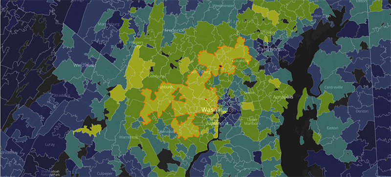
The Washington Post published this last month and I missed it, but there’s no time like today for good graphical representations of inequality. The Washington Post ranks zip codes from the 1st to 99th percentile based on the average income and college education of residents, relative to all other US zip codes.
A few fascinating points, at least for me.
I agree that the combination of income and education level matter when comparing the geographic distribution of inequality.
Zip code is a crude measure compared to street-level granularity. Some consider my immediate neighborhood relatively affluent, but my zip code ranks a 9 on the map, the bottom decile in the country.
Many affluent people, in addition, would not choose to live in my neighborhood because it is relatively heterogeneous. Which is a fancy word for rich people don’t want to live near poor people, so they avoid my neighborhood. My neighborhood also borders and is very close to poverty-stricken areas on the map, zip codes that rank a 1 nationally.
See the Washington Post Graphic, you will be fascinated, I promise.
Post read (2735) times.